Foxtrot Membership
Redefining the loyalty experience
Overview
Foxtrot is where modern convenience meets the charm of a neighborhood shop. It’s part café, part market, part digital app. Whether it’s coffee on your commute, a quick lunch with friends, or a last-minute bottle of wine, people turn to Foxtrot for the everyday moments that feel a little more special.
When we looked at customer behavior, we noticed a clear pattern: the more people engaged across channels (in-store, online, and in-app), the stronger their connection to the brand. This insight inspired the team to reimagine a loyalty program that not only rewarded existing habits but also encouraged new ones.
I partnered with teams across product, brand, and retail to shape the strategy and design a program that brought it all together.
Year
2022
Role
Product Design Lead
Scope
User Experience
Customer Experience
Website Design
App Design
CMS Design
Platform
Website
iOS
Android
Web App
Design in collaboration with the Brand team at Foxtrot
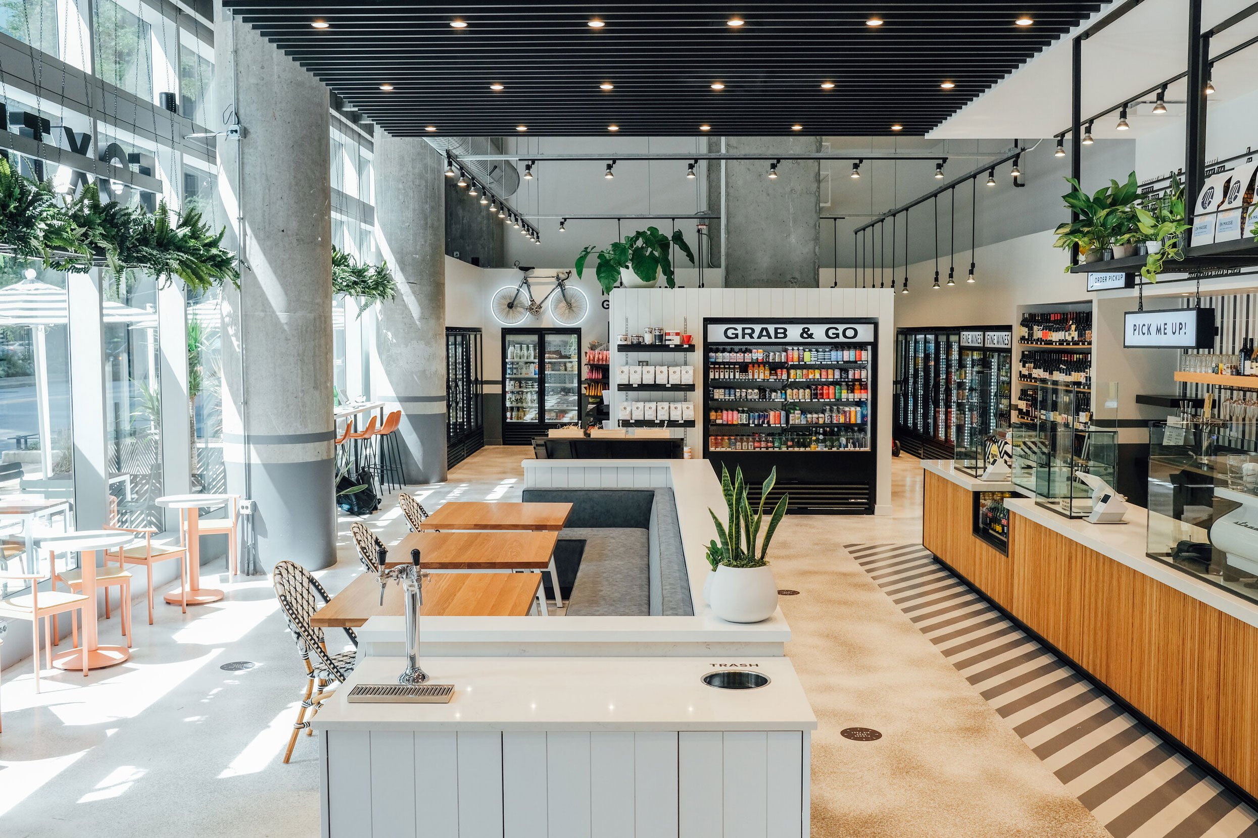
Foxtrot Market in Streeterville, Chicago | Photo courtesy of Foxtrot
Introducing Membership,
a community for food lovers
We began by digging into customer feedback, analyzing the existing loyalty program, and studying how people interacted with the brand. Through surveys, competitor analysis, and insights from Foxtrot’s most loyal customers, it became clear that the original points-based program felt transactional and missed the emotional connection that drew people to Foxtrot in the first place.
So we flipped the script. Working closely with the Brand team, we developed a new identity: Membership—a community of people who share a common love for food, complete with exclusive benefits and insider privileges.

A loyalty structure built for everyone
One of our goals was to create a program that felt approachable for all customers, not just power users. Instead of a tiered system that made people feel like they had to earn their way in, we focused on making every interaction feel valuable.
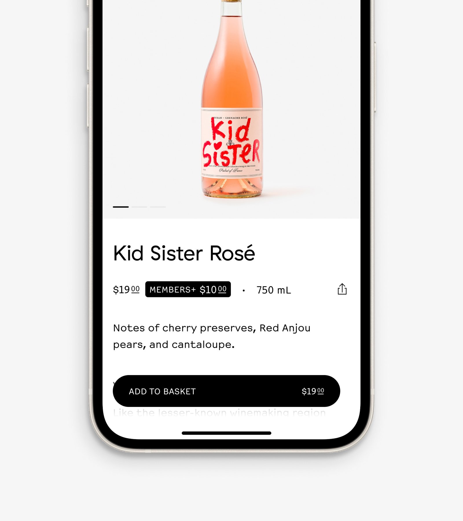
We designed the program to reward exploration, not just frequency. Whether someone placed their first order or shopped weekly, they’d find moments of delight like surprise rewards, member-only products, or discounts that nudged them toward discovering new parts of the brand.
The app as the centerpiece
The Foxtrot app was already a high performing channel with strong adoption, so it made sense to anchor Membership there. We brought the experience to life in-app, giving users a central place to track rewards, discover member-only products, and explore what’s next.
To guide people there, we used a mix of touchpoints (store signage, email, push, and even conversations with store staff) to meet people where they were and gently point them toward the app.
Connecting digital and in-store
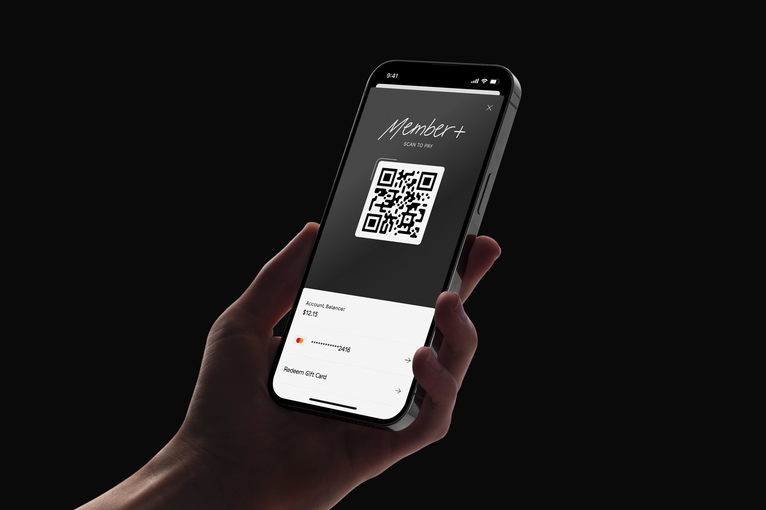
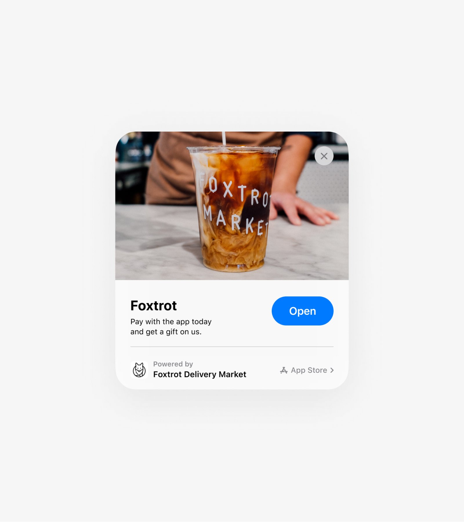
To make it easy for in-store customers to jump in, we introduced an App Clip: essentially a lightweight version of the Foxtrot app that could be launched via QR codes placed throughout stores.
This wasn’t a hard push to download the app; it was a soft entry point: scan, get a welcome treat, and start exploring. It helped us create a bridge between the physical and digital experience without adding friction.
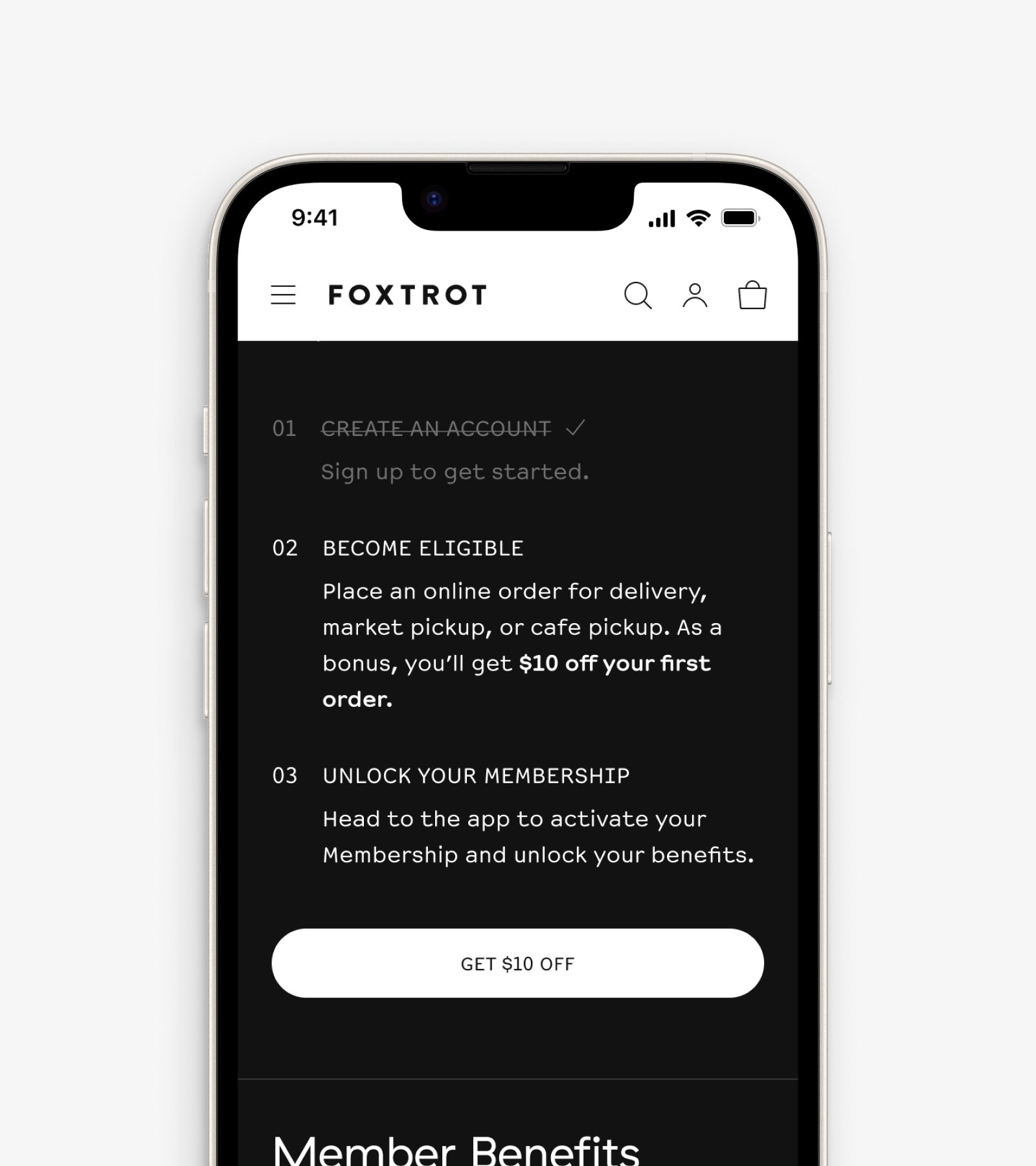
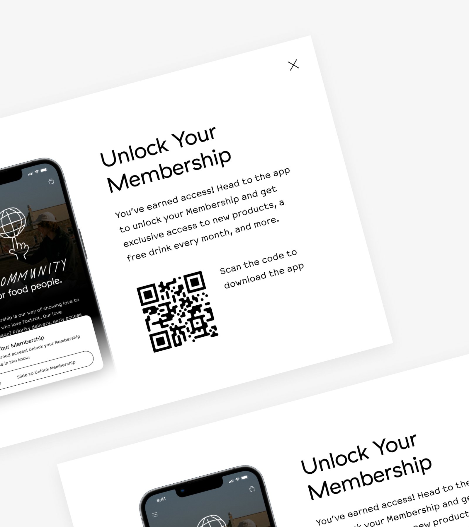
Bringing web users into the fold
We didn’t want to leave out customers who preferred shopping online. We created a dedicated Membership page on the website to explain the benefits and prompt the transition to the app, with tailored incentives and smart routing, whether on desktop or mobile.
This helped widen the funnel while reinforcing the idea that the best version of the experience lived in the app.
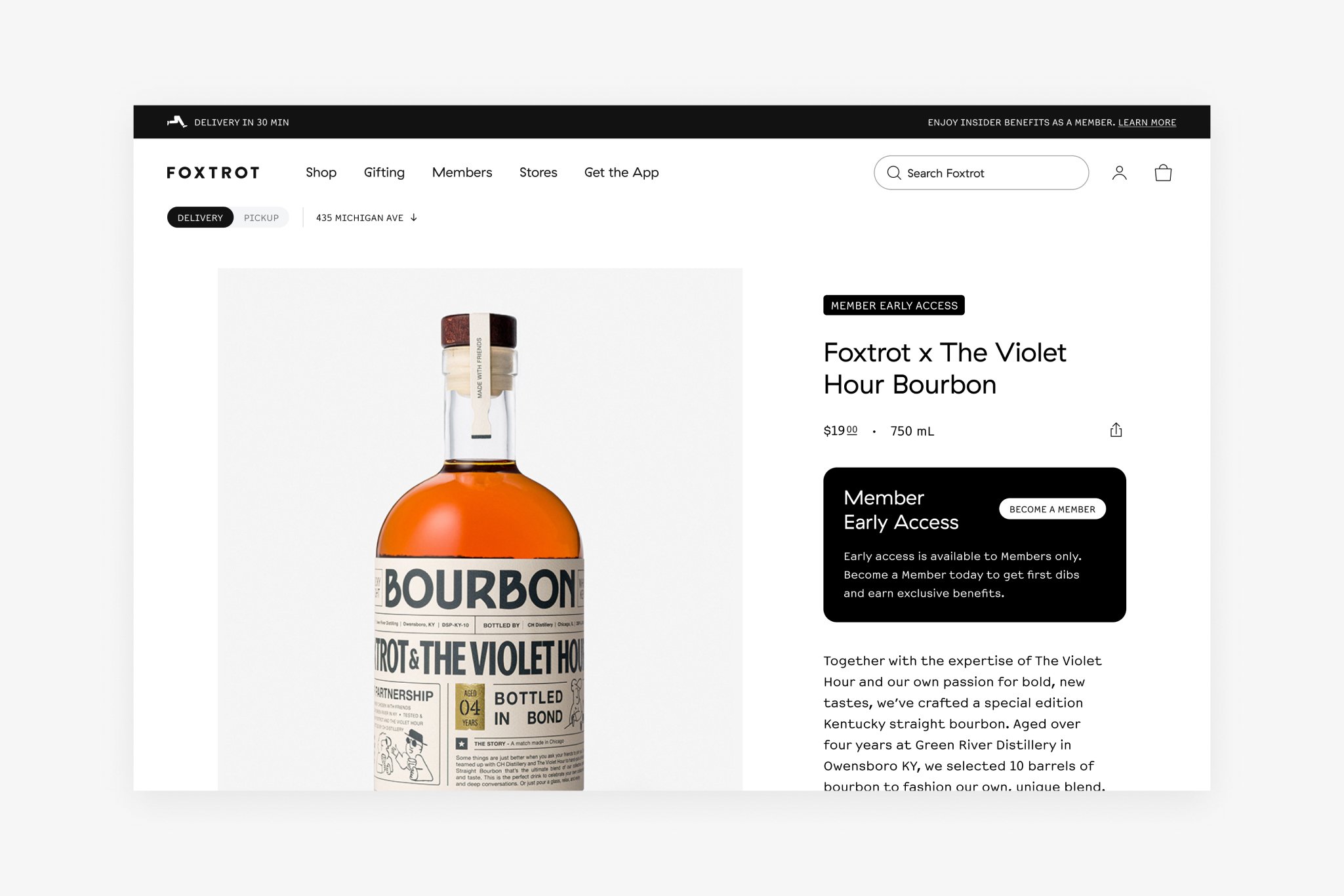
Sparking curiosity along the way
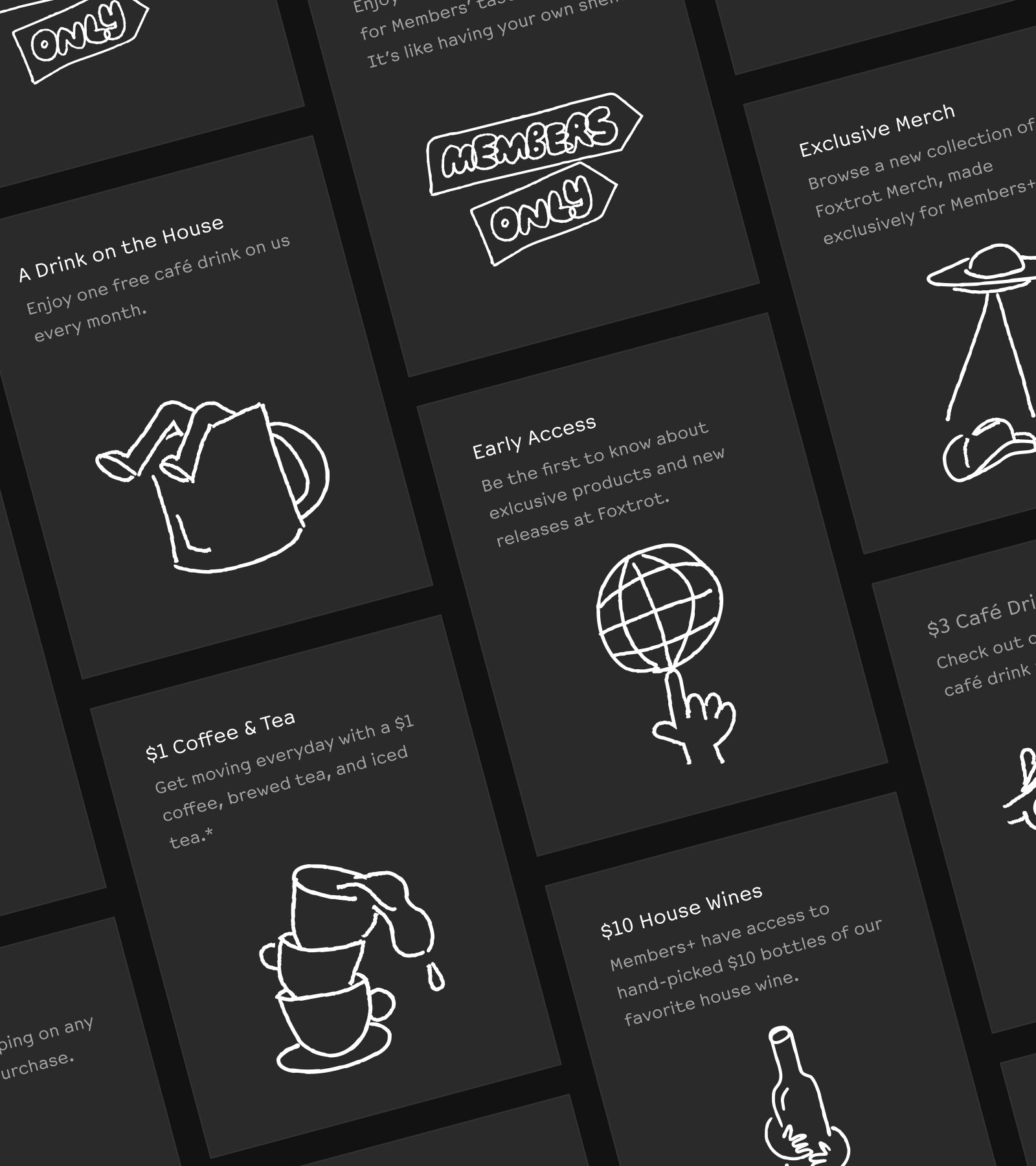
As we rolled out Membership, we used design to build intrigue. Subtle cues like “locked” products, member-only tags, and a dedicated Membership collection created a sense of curiosity for non-members.
These moments invited people to explore without overwhelming them with a hard sell.
Encouraging the leap into Membership
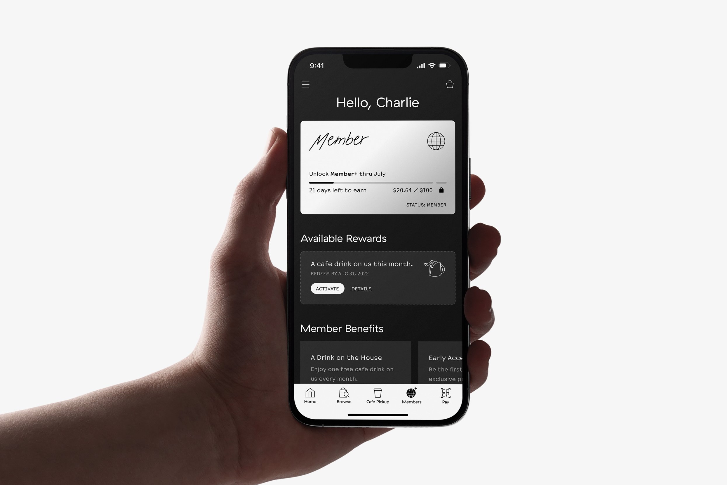
Inside the app’s Membership section, a persistent banner kept the program top of mind and added a gentle nudge to take the next step.
To unlock Membership, users simply had to complete their first pickup or delivery order. It was a low lift, but an intentional one. It created just enough urgency to encourage action, while making the reward feel earned.
A satisfying moment of entry
Once users met the criteria for joining, we introduced a small interaction that made the moment feel more meaningful. A “slide to unlock” gesture replaced the static banner in the Membership section, creating a sense of ceremony and progress.
This playful bit of friction was inspired by the IKEA effect: when people feel more invested in things they helped bring to life.
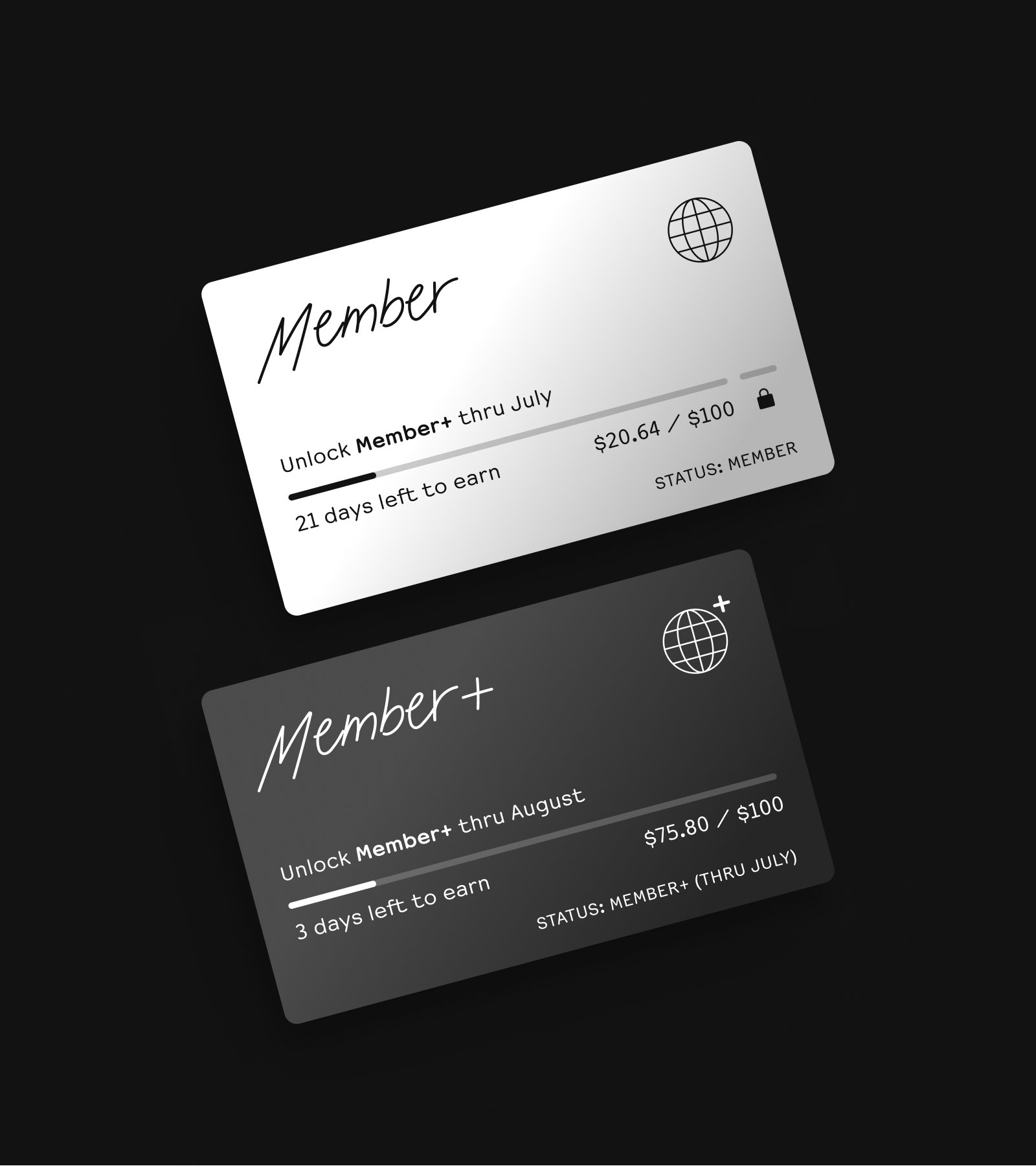
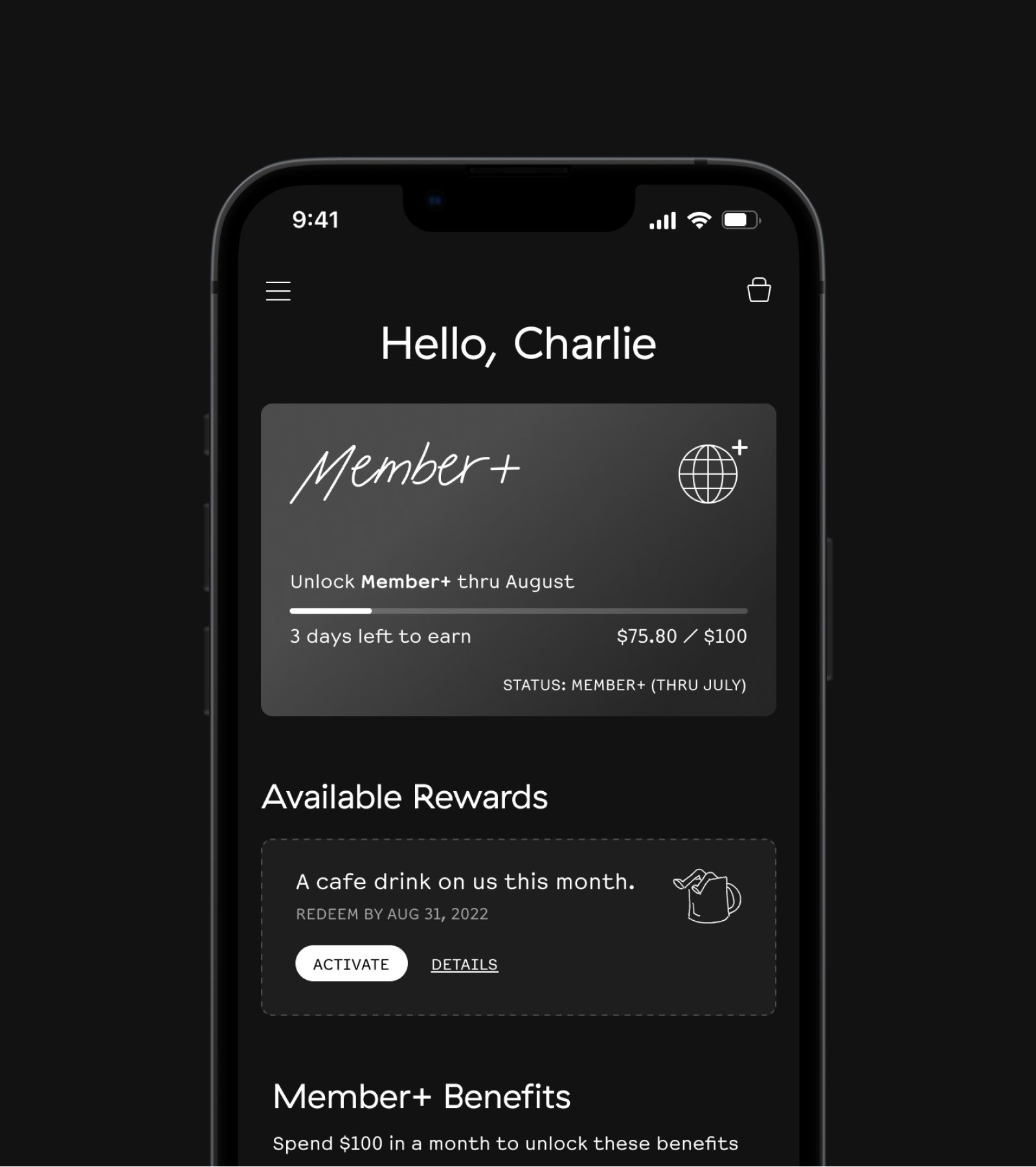
Keeping the experience alive
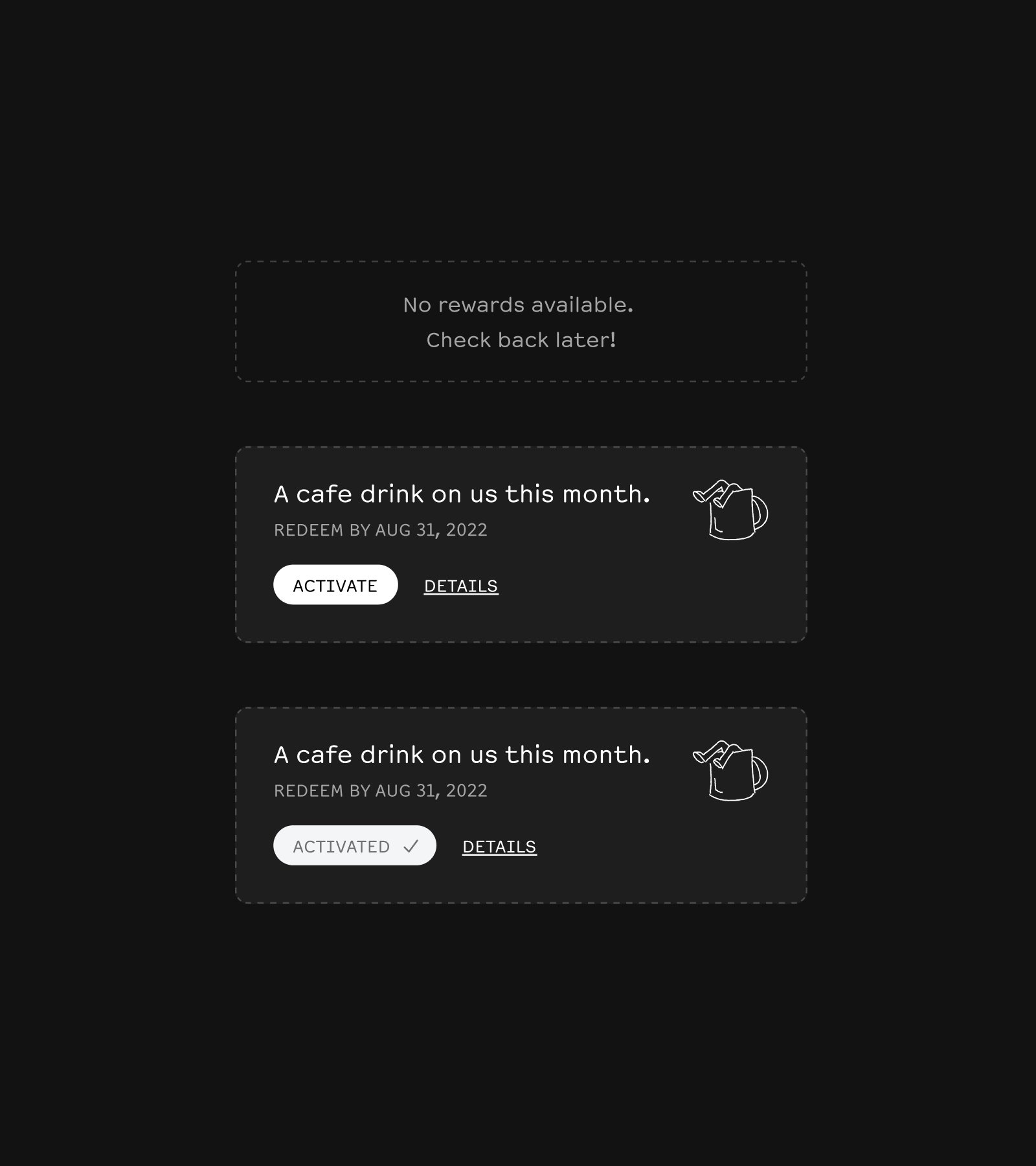
After joining, members got access to a rotating collection of exclusive products, monthly perks (like a free café drink), and a fresh sense of discovery with every visit. These benefits gave people reasons to keep coming back, both online and in-store.
We also used design elements like a personalized Membership card and payment screen cues to reinforce a sense of belonging. Over time, these small signals added up to something that felt bigger than just a discount.
Outcomes
Increased Customer Value: Membership helped customers discover more of what Foxtrot offered, leading to broader engagement and higher order values. It also drove more cross-channel behaviors like ordering ahead, picking up in-store, or discovering new categories.
Stronger Loyalty & Word of Mouth: By making the experience feel more human and less transactional, we built deeper brand affinity. People didn’t just return; they told their friends, too.
Richer Customer Insights: With more customers opting in and engaging across channels, we gained a clearer picture of behaviors and preferences, which informed future product, marketing, and merchandising strategies.